Varsity Tutors: Navigation & Search
BACKGROUND
Problem: The rapid expansion of our product offering overextended the capabilities of our navigation
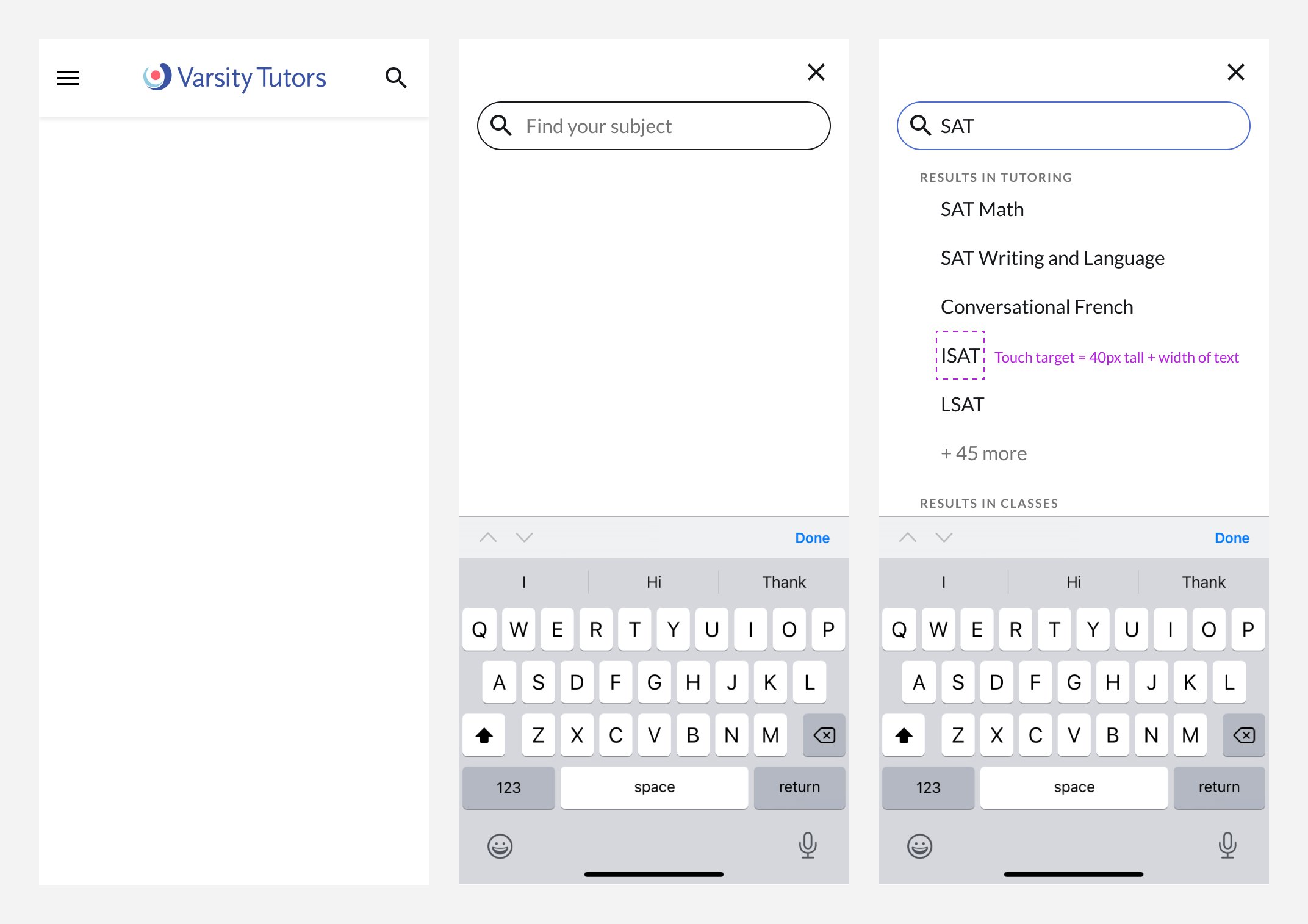
Varsity Tutors began as a tutoring company, but over time, we added classes and self-study tools for grades K-adult, B2B products, and seasonal activities for kids during the summer months. The navigation needed to support multiple product offerings that spanned over 3,000 subjects. We also needed to implement the ability for users to search given the sheer number of product offerings available (learning format x subject x grade level = hundreds of thousands of results).
Our ability to implement search was uniquely challenging. Due to tech debt, tutoring subjects lived within a different repository than classes. Commingling them into a single set of search results in the timeframe we were up against was deemed to be implausible by stakeholders, presenting me with a challenging (fun) design problem.
I led the UX and design of an updated navigation and the introduction of search functionality.
PROCESS
Planning
SEO played a large role in shaping our decisions. I worked closely with our marketing team to identify SEO requirements and understand which subjects and keywords were critical and why. I created a color-coded spreadsheet that enabled us to collaborate easily and fluidly add, edit, and remove navigation items as we progressed.
Research: Balancing requirements & challenges with speed to deliver
As the contents of the navigation were shaping up in our spreadsheet, I began researching navigation formats and best practices documentation. I narrowed our options down to two: drop-down menus or a mega menu.
Exploration: Navigation format
Mega menu pros
Better discoverability of product offerings
More real estate to accommodate both UX and marketing opportunities
A single surface eliminated complexities with breakpoint sizes
Mega menu cons
Brand new design and functionality meant more time needed to design, test, build, and execute
Drop-down menu pros
Existing functionality meant we could execute faster
A simpler A/B test plan comparing apples to apples
Drop-down menu cons
Discoverability is more limited—users have to know (or guess) exactly where to go
Required limiting content to a fixed number of top-level categories to avoid breaking to a hamburger menu on narrower viewports
Exploration: Search
Since the tutoring and class repositories were separate, I entertained housing a search capability within each of the classes and tutoring menus, but we eliminated this idea because we felt it wasn’t visible enough, nor was it a conventional search pattern. I also explored an affordance to select tutoring or classes as a way to fork the search results, but it felt clunky and ultimately required the user to do more work than they should have to.
Testing: Identifying the best solution & balancing it against requirements
We conducted a moderated usability test, and the mega menu was the clear winner. Unfortunately, design and engineering had limited time to deliver due to massive missed opportunities (potential customers weren’t able to find what they were looking for even though we had it). Ultimately, the decision was made to maintain our existing structure (drop-down menus) in lieu of building a mega menu in order to launch quickly. Additionally, we conducted tree testing to validate our navigation categories.
Final handoff & specs: A step in the right direction
While we didn’t get to see a mega menu come to life, we made several improvements from an organizational, structural, and SEO perspective. And, the addition of search functionality was a big win for the customer experience.
Results
Analytics and heat maps confirmed that the improved taxonomy outperformed the previous model by significant margins, allowing us to roll out the new navigation and search functionality to 100% of users within days. Class registrations and tutoring inquiries increased by 38% and 27% respectively. Additionally, we saw a steep reduction in bounce rates and increased time spent on the site.


